Idrees Posted September 28, 2007 Posted September 28, 2007 Hi guys,Noticed a few changes to the site recently..Firstly the seperate car sections which I don't think is a bad ideaAnd the picture added on the home page where on the Photo section. Looks tacky imo, am I just being picky or do others think the same?Cheers, no offence or anything intended!! Quote
Mikey Jay Posted September 28, 2007 Posted September 28, 2007 Think it would look better if every section had a similar picture yeah Quote
Nanglebadger Posted September 28, 2007 Posted September 28, 2007 Thanks for the feedback guys, im sure Geo will be along in due time to see your feedback, personally i like it altho i wouldnt complain if a few more sections had similar pics, would look goooooood!Phil. Quote
Guest Enzo Posted September 28, 2007 Posted September 28, 2007 hey any feedback is greatly apreaceated, ive not finnished with the gallery and members ride section yet. trying to make the forum less complicated but notthing is rigid if not liked. also trying to breed good photos as that will provide rich content for the front site i aim to get a decent picture for every heading but id like to know if you guys think its a good idea with or without themso any feedback is greatly apreaceated Quote
gaz Posted September 28, 2007 Posted September 28, 2007 So basically a different heading for each section on the site?I think that would be well smart, if its the same heading, but say the colour or the car pictured or even both change. Quote
Guest Enzo Posted September 28, 2007 Posted September 28, 2007 yea im going to remove the text from the current pic, Quote
Nanglebadger Posted September 28, 2007 Posted September 28, 2007 different car pic for each section sounds good to me!!Phil. Quote
Idrees Posted September 28, 2007 Author Posted September 28, 2007 I'm not with the idea of having a picture for each section, will look well cluttered and make it more difficult to use. Just my 2p Quote
Mikey Jay Posted September 28, 2007 Posted September 28, 2007 Reckon as long as all the pics are the same size won't look too cluttered, and will set UKSC apart from other forums Go for it bossman ;) Quote
Idrees Posted September 28, 2007 Author Posted September 28, 2007 Yup, its worth a try to say the least. Quote
paul w Posted September 29, 2007 Posted September 29, 2007 The pics gallery foto is back to front too! Needs flipped over;) Quote
Sparky Posted September 30, 2007 Posted September 30, 2007 More pics please UKSC is getting awsome guys keep it up ;) Quote
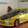
RobSR Posted September 30, 2007 Posted September 30, 2007 i think different headers for each section is an awesome idea, you can use this for the ep91 n/a section if you like, i dont mind, and i dont think the heard will either.......obviously ill take the 'inlinephotography' bit off, i just could be bother at the moment lol.Rob Quote
Guest Enzo Posted October 1, 2007 Posted October 1, 2007 ok thats great rob i will use that i need to find out what size ive set the pictures too, i might adjust them a wee bit to make them smaller.if anyone has any more coments on this the better,also if anyone feels like submitting more headers feel free, ;) Quote
Nanglebadger Posted October 2, 2007 Posted October 2, 2007 wee bit smaller would look real smart Geo man!Phil. Quote

Recommended Posts
Join the conversation
You can post now and register later. If you have an account, sign in now to post with your account.